It is hard to believe we are about to finish our 26th year of business here at Country Pasta. I was a mere 14 years old when my parents started making their homemade pasta. Yes, I realize you can do the math and figure out how old I am now, but doesn’t that just add significance to the story? I have spent the last 26 years of my life and career weaving in and out of being involved in the family business. I feel very fortunate to have grown up with the opportunity to have these types of experiences. Meeting with large company buyers at the age of 19 is not always something people get the chance to do. And I still recall my very first solo sales meeting with one of our biggest customers almost 10 years ago. It was nerve racking and exhilarating at the same time.
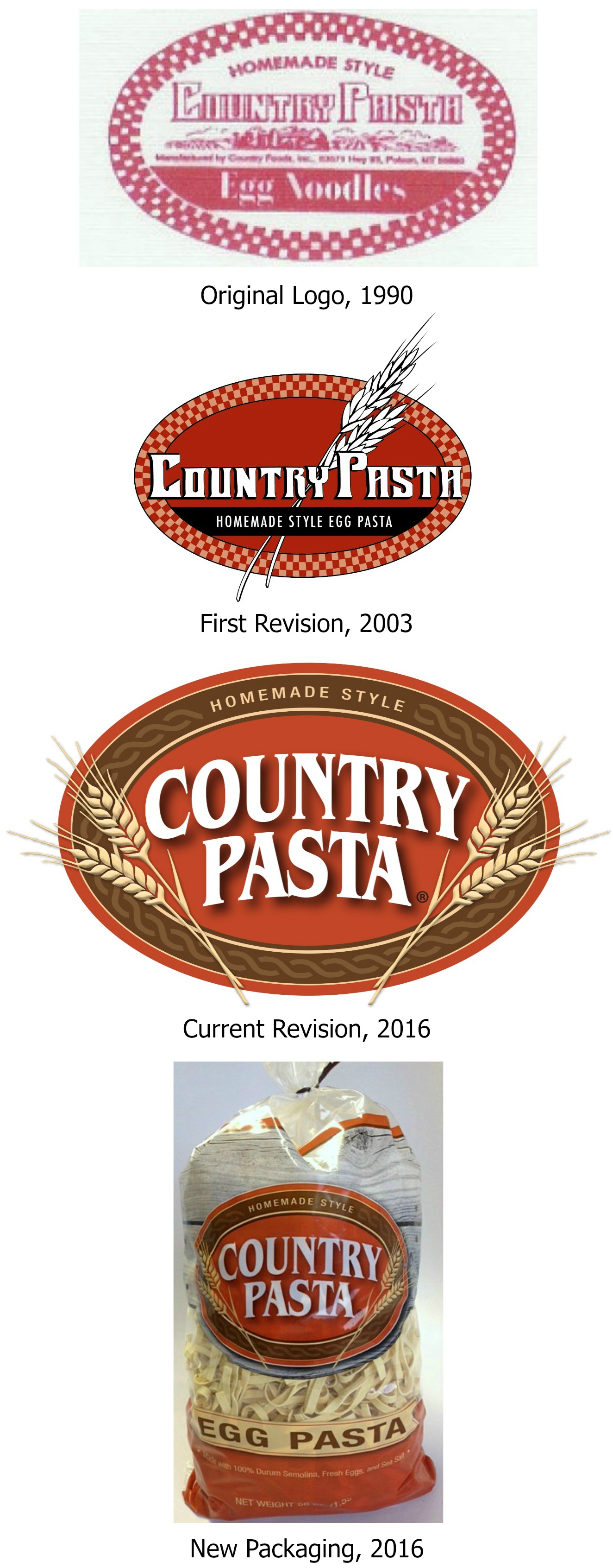
This company is as grassroots as they come. For example, the very first logo they did was developed by their friend who owned the local print shop in town. The business did very well with that logo, growing distribution quite largely in the first 13 years of business. At the time, being a young ad exec, I thought we needed a fresh look and convinced my parents we needed to do an update. So began the process of introducing Country Pasta 2.0.
So in 2003 we focused on cleaning up some of the many elements that were included in the first rendition, and made the colors a bit bolder. We were very pleased with this logo, and it had a good thirteen year run until earlier this year we decided once again to do another update.
We are very excited to be launching our new logo over the course of the coming months! For this version we focused on giving the logo a more earthy/homegrown feel to it by adjusting the colors and updating the fonts a bit. Of course we wanted to keep the wheat stalks, but we updated them to a more natural looking version. We feel this look better represents the natural, high quality pasta that we provide you each and every day.
In addition to updating the logo, we also decided to do a more comprehensive packaging change. And boy did we have fun with this! We worked with another great Montana company, The Wendt Agency, to help with these updates. Their team went above and beyond by showing us five great new looks. As you’ll see, the one we landed on includes a rustic wood look that we thought complemented the logo very well, and certainly triggered the wholesomeness and old fashioned elements that represent our pasta.
We included our entire team, as well as extended family members, in this whole process. We had a lot of fun at meetings discussing the intricacies of the different designs and what we liked or didn’t like. Overall, it was a very fun process and we are excited to be sharing our new design with you.
We hope you will like it as much as we do!
And of course since we were going to be launching new packaging, we had to do a website update as well. We look forward to continuing to share recipe ideas, stories from the factory, and other fun stuff with you through this outlet.
Please be sure to check out our bold new site at staging.countrypasta.flywheelsites.com.
As 2016 is coming to an end and we begin looking ahead to our 27th year of business, we are filled with optimism and fresh energy. We hope you are, as well!
Here’s to change!


2 Comments